Embedding live graphs in websites
This is a guest post by Callum McIntyre. You can follow him on twitter at @callum_codes
At the start of this month I decided to try to run more consistently. I record my workouts with an Apple Watch but I wasn't getting the sort of analysis I wanted from that. I'm a developer so it seemed like a fun project to build the exact analytics I wanted for myself. I decided to use GraphJSON because 1) its visualizations seemed like a great fit, and 2) I didn't want to maintain my own database. This article describes how I built my personal running dashboard using GraphJSON.
Goals
I had a few requirements that I wanted to achieve:
- Display some visualizations of my running data, such as total distance and average pace
- Compare my data over time to see how I'm progressing
- Have it automatically update with new runs
- Be easy to maintain!
Importing the data
My workout data lives in Apple Health, so my first challenge was to work out how to get it into GraphJSON. I started by purchasing https://healthexport.app which is an iOS app that can export workout data to CSV. Here's what that data looks like, formatted as a table:
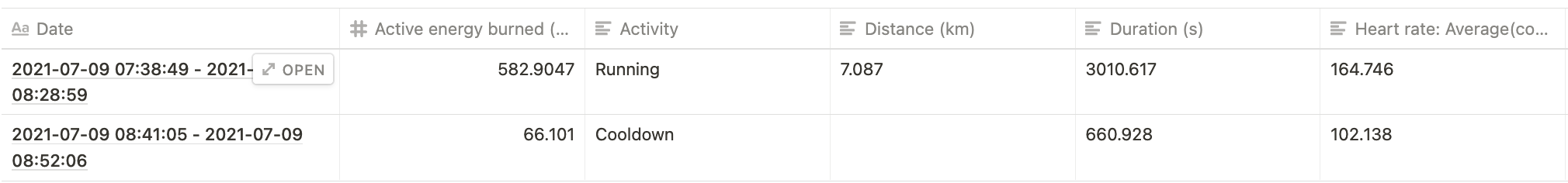
To import this data into GraphJSON I need to do a few things:
- Generate a UNIX timestamp from that Date field
- Convert the whole thing from CSV to JSON
- Perform preprocessing. In particular I want to produce a new field to show my pace for a run in mins/km in addition to some rounding. I also filter out everything except Running workouts.
I wrote an API call that could receive the CSV, convert it to JSON, process it and submit it to GraphJSON's logging API. This is orchestrated with an iOS shortcut, so the workout data is exported to a CSV by the workouts export app and then the resulting CSV is submitted to this API.
I won't go into all the details here (the app is open source if you're interested), but here's what the JSON submitted to GraphJSON looks like after processing:
{
  "event":{
    "distance_km": 4.633,
    "duration_mins_f": 31.9,
    "heart_rate_avg_rounded_i": 161,
    "pace_mins_per_km": 6.88,
    "project": "callum_runs_prod",
  },
  "timestamp": 1626076462
}
Deduplication with GraphJSON
The workouts export app I'm using is a bit limited, and the most fine grained option it has is exporting all workouts today. This means that if the shortcut is run multiple times a day then it will submit the same workouts multiple times. I don't want the same run in GraphJSON more than once so I need to de-duplicate. As mentioned before, I want this whole thing to be easy to maintain - I don't want to keep my own database to compare against. This is where the GraphJSON samples API comes in.
I request a list of all data in the last day that I've already logged.
const payload = {
  api_key: graphjson_api_key,
  IANA_time_zone: "Europe/London",
  graph_type: "Samples",
  start: "1 day ago",
  end: "now",
  filters: [["project","=",callum_runs_prod]],
}

await fetch("https://graphjson.com/api/visualize/data", {
  method: "POST",
  headers: { "Content-Type": "application/json" },
  body: JSON.stringify(payload)
});
This returns an object of the shape:
{
  result: [
    { json: [Object], timestamp: 1625352106 },
    { json: [Object], timestamp: 1625352111 },
    ...
  ]
}
For my use case I only need the timestamps, since there will never be multiple valid runs starting on the same second. On the server I filter out any input events that contain a timestamp already in GraphJSON, before submitting the events.
Generating the graphs
At this point I have an iOS shortcut that can submit workout data to my server, which uploads events to GraphJSON. It is scheduled to run a few times a day automatically. By looking at the samples view I can see that the data is present. Now I can generate the charts!
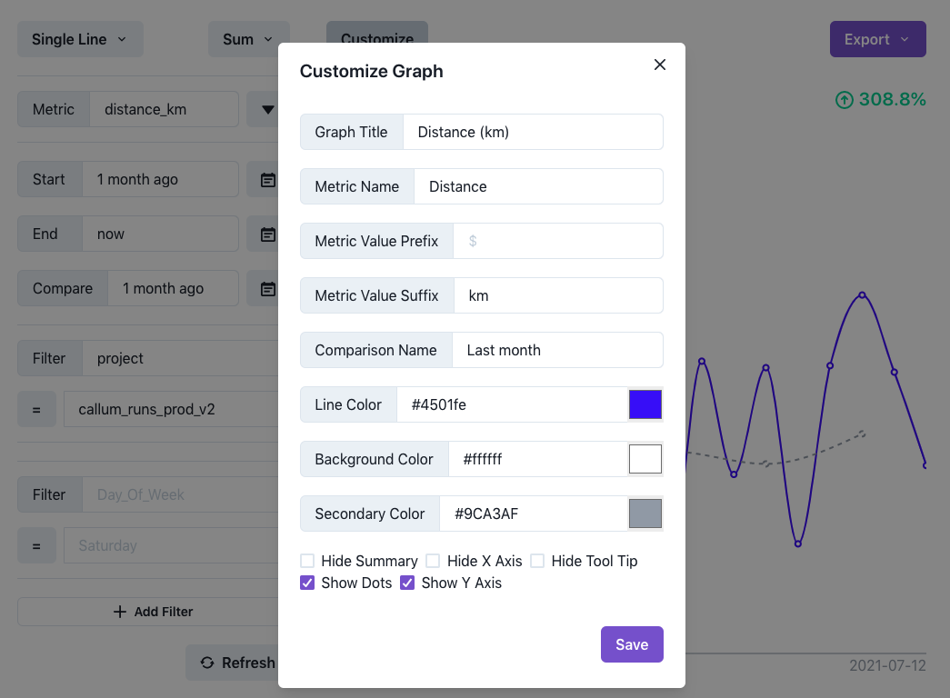
Sum metric
I use the sum metric to display my total distance and total running time in the last month, and compare these with the previous month. Here's how one of those charts is configured:
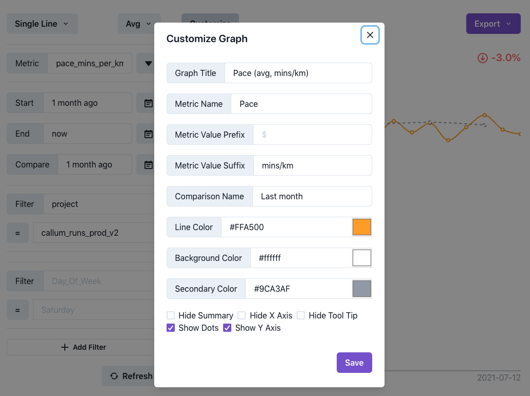
Avg metric
I use the avg metric to display my average heart rate and pace per run, again comparing to last month. Here's how one of those is configured:
Combining them all into my dashboard, I get exactly the analytics I wanted:
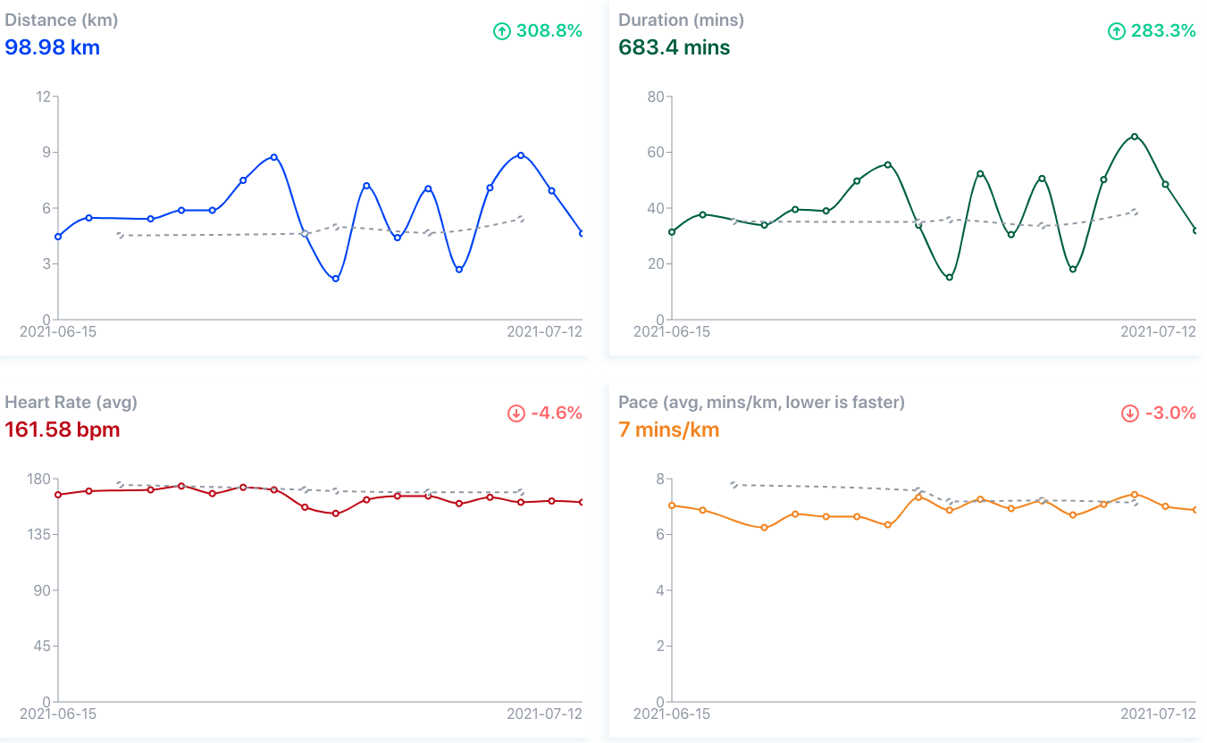
You can see it live and interact with the charts on running.callumm.dev!