Creating retention curves
One of the most common metrics companies track is retention cohorts. For example, a shoe company might track what % of people who buy shoes one month come back 6 months later. Similarly a SAAS company might track what percentage of users who signed up a year ago are still active today.
In this tutorial I'm going to walk you through how to build retention curves in GraphJSON. Let's say we are a SAAS company and we want to track the weekly retention of our users. Or in other words, for some group of users who sign up on week 1, what % of them come back on week 2? week 3? etc
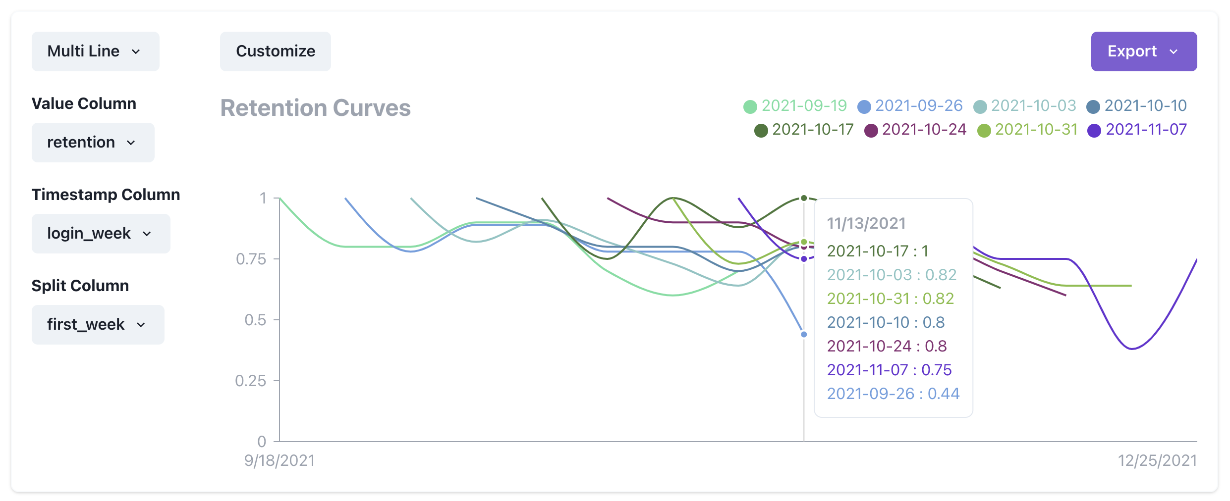
We can then plot a series of these curves to see if our retention is improving over time.
Step 1 - Create the collection
The first step is to create a collection where we will log our data to. Collections are a really handy way to organize your data. Simply navigate to https://www.graphjson.com/dashboard/collections and click the "New Collection" button on the top right.
In this example, I named the collection "retention".
Step 2 - Log the data
Let's create a logging module so we can have cleaner code when logging. The module I create looks as follows:
export function log(json) {
  const payload = {
    api_key: process.env.api_key,
    timestamp: Math.floor(new Date().getTime() / 1000),
    collection: "retention",
    json: JSON.stringify(json)
  };

  await fetch("https://api.graphjson.com/api/log", {
    method: "POST",
    headers: { "Content-Type": "application/json" },
    body: JSON.stringify(payload)
  });
}
Now to finish logging, we simply insert the following code where the events we care about happen. In this case we care about when a user loads the dashboard
import { log } from "@/lib/log";

export function loadDashboard(user) {
  // ... Code to load dashboard
  log({
    event: "load_dashboard",
    user_id: user.id
  });
}
You'll notice that we log the user id in addition to the event. This allows us to do user level retention curves in the next step.
Step 3 - Visualize the data
After adding the logging, we should be able to see the data via the query tool. Let's make a new query. Go to https://www.graphjson.com/dashboard/queries and click on "New Query" at the top right corner.
We can run a really simple query to begin to see if we have the data. For instance we can inspect the data in our "retention" collection with the following query:
SELECT
    *
FROM
    retention
LIMIT
    10
After running that query you should see the JSON blobs you've logged. Now let's proceed with the cohort retention analysis. To do that we'll run the following query:
WITH by_week AS (
  SELECT
    JSONExtractString(json, 'user_id') as user_id,
    toUnixTimestamp(
      toDateTime(
        toStartOfWeek(
          toDateTime(timestamp, 'America/Los_Angeles')
        )
      )
    ) AS login_week
  FROM
    retention
  WHERE
    toDateTime(timestamp, 'America/Los_Angeles') > subtractMonths(today(), 3)
  GROUP BY
    user_id,
    login_week
),
with_first_week AS (
  SELECT
    user_id,
    login_week,
    first_value(login_week) OVER (
      PARTITION BY user_id
      ORDER BY
        login_week
    ) AS first_week
  FROM
    by_week
),
with_cohort_size AS (
  SELECT
    first_week,
    COUNT(DISTINCT user_id) as cohort_size
  FROM
    with_first_week
  GROUP BY
    first_week
),
with_week_number AS (
  SELECT
    A.user_id as user_id,
    A.login_week as login_week,
    A.first_week as first_week,
    B.cohort_size as cohort_size
  FROM
    with_first_week A
    LEFT JOIN with_cohort_size B ON A.first_week = B.first_week
)
SELECT
  COUNT(*) / AVG(cohort_size) AS retention,
  toDateTime(first_week) AS first_week,
  login_week
FROM
  with_week_number
GROUP BY
  first_week,
  login_week
That's a lot! Let's break it down:
First off, all these WITH statements are known as Common Table Expressions or CTE. You can think about it as assigning some result of executing a query to a variable. So for instance in the first WITH block we see
WITH by_week AS (
  SELECT
    JSONExtractString(json, 'user_id') as user_id,
    toUnixTimestamp(
      toDateTime(
        toStartOfWeek(
          toDateTime(timestamp, 'America/Los_Angeles')
        )
      )
    ) AS login_week
  FROM
    retention
  WHERE
    toDateTime(timestamp, 'America/Los_Angeles') > subtractMonths(today(), 3)
  GROUP BY
    user_id,
    login_week
),
This simply creates a bunch of rows from the last 3 months, each representing a particular point in time when a user loads the dashboard. Each row has a user_id, as well as the timestamp of the week that they logged in. Notice how we use the function toStartOfWeek to normalize all timestamps. We assign all of these rows to the alias by_week via the CTE.
Let's move on to the second clause
with_first_week AS (
  SELECT
    user_id,
    login_week,
    first_value(login_week) OVER (
      PARTITION BY user_id
      ORDER BY
        login_week
    ) AS first_week
  FROM
    by_week
),
This expression uses window functions to add an additional column first_value to the previous table, representing the first week that the user loaded the dashboard (AKA when the user signed up).
Onwards! The third clause looks like this
with_cohort_size AS (
  SELECT
    first_week,
    COUNT(DISTINCT user_id) as cohort_size
  FROM
    with_first_week
  GROUP BY
    first_week
),
This simply calculates the number of unique users per cohort. We'll use this later.
The fourth clause looks like this
with_week_number AS (
  SELECT
    A.user_id as user_id,
    A.login_week as login_week,
    A.first_week as first_week,
    B.cohort_size as cohort_size
  FROM
    with_first_week A
    LEFT JOIN with_cohort_size B ON A.first_week = B.first_week
)
This combines everything we've calculated so far. It joins the two tables, so now we know how big the size of each cohort is for a particular row.
Ok we are at the end! The last clause looks like this
SELECT
  COUNT(*) / AVG(cohort_size) AS retention,
  toDateTime(first_week) AS first_week,
  login_week
FROM
  with_week_number
GROUP BY
  first_week,
  login_week
All this does is give us a bunch of data points. Each data point has the cohort start week, the login week and the ratio of users who signed in that week.
So after running the query, we should get a table that looks something like:
| retention | first_week | login_week |
|---|---|---|
| 0.81 | 2021-10-31 | 1638057600 |
| 0.56 | 2021-10-24 | 1639872000 |
| 0.24 | 2021-09-19 | 1633824000 |
You might wonder why we convert the first_week to a date time but keep login_week as a unix timestamp. The reason is that to graph lines, we need the x axis values to be unix timestamps. However, for labels, we can have more useful human readable labels.
Now all we need to do is click on the "Visualization Tab" and configure our columns like below and bam! We have retention curves!